Building Your Own Year-End Music Summary: A Step-by-Step Engineering Guide
Introduction
Every December, Spotify users eagerly await their Wrapped—a personalized recap of their listening habits over the past year. But behind those colorful slides lies a sophisticated pipeline of data collection, analytics, and storytelling. This how-to guide walks you through the core engineering steps to create your own version of a year-end music summary, from raw listening logs to a compelling narrative. Whether you're a data engineer, a music enthusiast, or just curious about the tech, these steps will help you turn millions of play events into a meaningful glimpse of someone's musical journey.
What You Need
- Access to listening history data – ideally timestamped streams with track, artist, album, genre, and duration.
- Database or data warehouse (e.g., PostgreSQL, BigQuery) to store and query large datasets.
- Programming environment with Python (pandas, numpy), SQL, and visualization libraries (matplotlib, plotly, or a web framework like React).
- Natural language generation (NLG) tool – from simple templates to advanced LLMs (e.g., GPT) for creating captions.
- Compute resources – at least a multi-core server or cloud instance to process millions of rows efficiently.
Step-by-Step Guide
Step 1: Collect and Clean the Listening Data
Your raw data is the foundation. If you're using real user data (with consent), start by extracting logs from the streaming platform. Each record should include: user_id, timestamp, track_id, artist, album, genre (if available), and play duration. Clean the data by:
- Removing incomplete listens (e.g., duration < 30 seconds) to avoid accidental skips.
- Deduplicating consecutive repeated plays of the same track (some people loop a song).
- Outlier handling: normalize time zones, cap extreme date ranges.
Store the cleaned data in a partitioned table (by month) for faster queries later.
Step 2: Compute Core Metrics
Now calculate the building blocks of any year-end summary: top artists, top tracks, total minutes listened, genre breakdown, listening hours per month, and most-played decade. Use SQL or pandas aggregations:
- Top Artists – count distinct plays per artist, rank by frequency.
- Top Tracks – same for individual tracks.
- Genre Distribution – map each track to a genre (using an external API or your own taxonomy), then compute percentages.
- Time Patterns – group listens by hour of day and month to reveal when the user listens most.
Store these aggregated results in a summary table for quick retrieval during story generation.
Step 3: Identify Interesting Moments
The magic of Wrapped lies in anomalies—unexpected highs, firsts, and streaks. You need to detect:
- First listen of a new genre or artist (first timestamp in the year for that entity).
- Listening streaks – consecutive days where the user streamed the same artist or genre.
- Spikes – days with abnormally high listening minutes compared to the user's average.
- Musical evolution – shifts in genre preference from January to December.
- Sleep vs. party – identify times of day with distinct listening moods.
Implement these using window functions in SQL or rolling statistics in Python. For example, a streak can be found by grouping consecutive same-artist plays and counting the days.

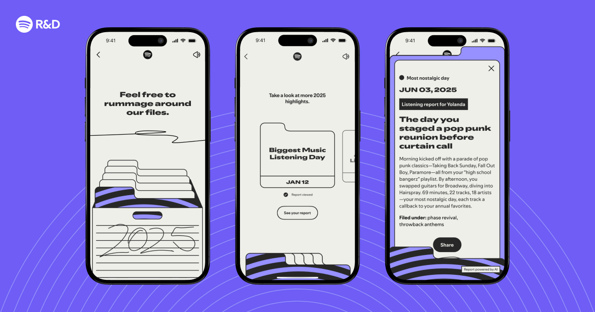
Step 4: Generate Personalized Narratives
This is where you turn numbers into stories. Build a templating engine that inserts the metrics from Step 2 and moments from Step 3 into pre-written sentences. For extra flair, use a language model to paraphrase. Example narrative blocks:
- "Your top artist was [Artist] with [X] plays—that's one listen every [Y] hours!"
- "You discovered [New Genre] on [Date] and haven't looked back. Your love for [New Genre] grew by [Z]% over the year."
- "Your longest listening streak: [X] days of [Artist]. We call that commitment."
Combine these into a coherent story, ordering them from most impressive to most personal. Ensure the tone matches your brand—playful, informative, or both.
Step 5: Visualize and Present
Finally, wrap the data and narratives into a shareable format. You can create:
- A static image (e.g., a single infographic card) using a charting library.
- An interactive web page (like real Wrapped) with scrolling animations, color themes, and data highlights.
- A PDF or social media template.
Key visual elements: circular progress bars for top artists, bar charts for genre mix, a timeline of listening hours, and a final "fun fact" card. Use your user's profile picture and a custom color palette to make it feel personal.
Tips for Success
- Optimize for scale – If you have millions of users, precompute aggregates in batch jobs (e.g., nightly cron or Airflow). Avoid querying raw logs in real time.
- Handle edge cases – Users with very few or zero listens need a friendly fallback (e.g., "You didn't log much music this year – start exploring!"). Also handle users who only listen to one song on repeat.
- Respect privacy – Never expose raw data or infer sensitive info (e.g., listening at 3 AM every day). Aggregate and anonymize where possible.
- Test with real users – Run a pilot to see which moments resonate most. A/B test narrative phrasing.
- Keep it fast – User patience is limited. Aim to generate the entire summary in under 500ms after the initial query.
By following these steps, you'll be able to recreate the technical core of a Wrapped-like feature. Remember, the goal is not just to present data, but to tell a story that makes each user feel seen and celebrated. Happy building!
Related Articles
- AI-Generated Music: A Flood of Creativity or Unwanted Noise?
- A Step-by-Step Guide to Adopting Agentic Development in Your Engineering Team
- How to Build Stable Streaming Interfaces: A Step-by-Step Guide
- Amazon Prime Video Launches 'Clips' Vertical Feed for Bingeable Snippets
- 8 Key Insights on Agentic Development from Spotify and Anthropic
- Spotify Reveals Cutting-Edge Tech Powering 2025 Wrapped: How AI Spots Your Year’s Most Meaningful Listening Moments
- How Spotify's Tech Crafts Your 2025 Wrapped Story
- Netflix Expands Ad Placement Across App as Ad-Tier Subscribers Surge